Estimated reading time: 7 minutes
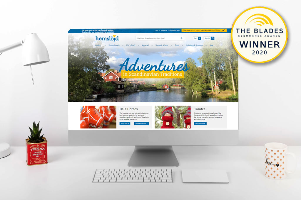
In August, we were honored to learn that the site outlined below was the recipient of Miva’s 2020 Blades Award for Most Improved Website. Let’s take a look at how we were able to breathe fresh life into a struggling website.
Early in 2019, a small family-owned business approached us looking for a website upgrade. They sold decor, snacks, and household items, imported from Sweden or handmade right there in the workshop in Kansas. The product line and the staff imparted a delightful sense of small-town charm and old-world wonder; their site, on the other hand, was just kinda small and old. Within a few months, Hemslojd Inc. had a bright and fresh new site that was appealing and welcoming to their shoppers. Not only that, it was an award-winning site.
A Look At the Transformation
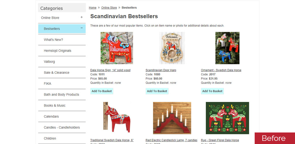
With a cursory glance of the old site, you can see plenty of images, text, and a valiant attempt at design. However, despite the owner’s best efforts, they can only do so much with the outdated infrastructure of the site.
Combining the limited capabilities of the current site with the typical busy schedule of a store owner, the old site looked as good as possible. But that isn’t enough for the modern customer.
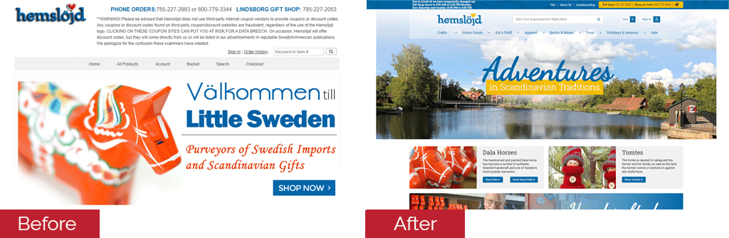
Homepage
Immediately, you can see that while the old site proudly boasted their Swedish heritage with a large, bright image of a Dala horse, it was dated. The full-width banner on the new site provides a wide welcome to the users, plunging them head-first into the spirit of Sweden.
TIP: Broad, open images that fill the screen give your user the sense of being encompassed by your brand, similar to walking into a store.
The dominant blue and yellow color-scheme that greets you upon entering the new site cheerfully reflects the Swedish flag. Overall, the immediate first impression upon page-load is a warm and inviting improvement.
Further down the page on the new site, you’ll find further expression of the spirit of Sweden with cultural items, vivid colors, and meaningful calls to action. Beyond the standard “shop now” of the old site, the user is invited to read about the history of the products, and explore the handcrafted items made on-site.
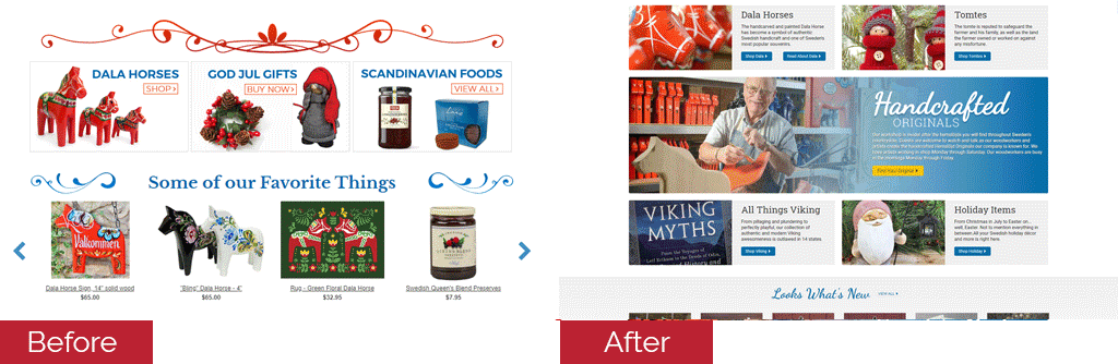
TIP: A definitive call-to-action can intrigue your shoppers and draw them in, prompting them to do more than just shop.
The inspiration section of the new design gives the visitor a more rounded experience. They are invited to participate in the culture by learning about different Swedish celebrations, food, and design. It then leads to a collection of articles and images taken from the new on-site blog.
This section not only features the most recent blog posts, it also provides resources for those that plan on visiting the store location, and the town in which it resides, Linsdborg, KA (aka Little Sweden).
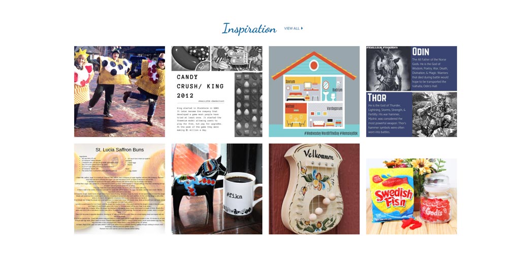
TIP: Offering your users valuable resources will turn them from one-time shoppers, into repeat customers. By knowing that your brand is the authority on the subject, your customers feel confident returning again and again.
Category Page
After the homepage design is complete, careful attention is paid to the category and product page functionality. They often need a significant amount of work to modernize, equip with top-of-the-line features, and then of course incorporate the design.
They often don’t have as many flashy features that immediately catch the eye, the way a homepage does. Carried out properly, a category page can be furnished with tools that not only provide a generally more pleasant experience for the shopper, but actually direct them toward making purchases.
These pages are critical in the UI/UX design process. The most important features of a website are often ones that the average user doesn’t see or even notice. Our developers have a special skill for combining exceptional functionality with seamless design in a way that guides the shopper through their journey.
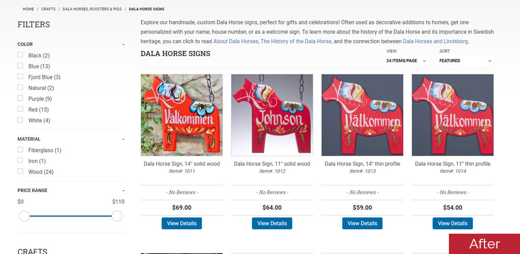
You’ll notice the responsive layout of the new size allowed the developers to take full advantage of the screen space. This provided plenty of room for larger, clearer images and a more spacious feel, over all.
The new site was also able to support the use of search facets and filters. The addition of facets provided a new dimension of customer service, enabling the user to customize their own shopping experience.
Beyond that, facets also reduced the amount of manual customer service needed by the store staff. Users can easily find the products that match their needs, without outside intervention.
Tying the homepage design into the category with coordinating fonts, button styling, and design attributes helps to keep a cohesive feeling, and reinforces branding.
TIP: A responsive design is absolutely imperative for modern eCommerce. It will expand the capabilities of your site, making features available to you and your shoppers that wouldn’t be, otherwise. That’s not to mention SEO and site visibility benefits.
Product Page
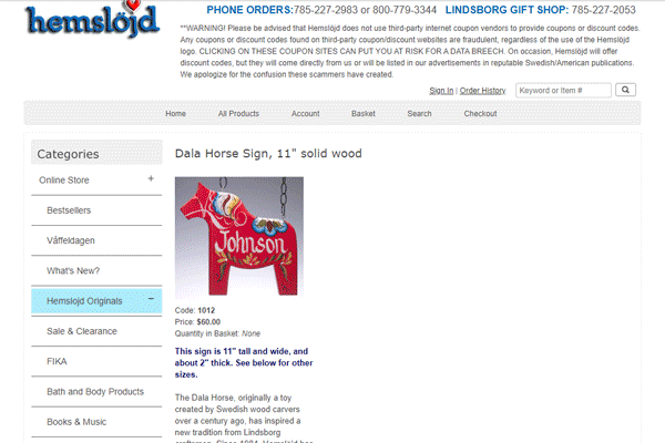
The product page is the real money-maker of any eCommerce website. The old Hemslojd site did a great job at informing the shopper about the product, providing dimensions, and product attributes like color options. They even went as far as supplying their customers with recommended products. But the design of the page was severely hindering the user experience.
Once again, a responsive site and cohesive design made a major impact on the product page. While the flashiest and most exciting changes may have happened on the homepage, the product page underwent a critical change.
The new Hemslojd product page beautifully fills the screen in a logical format. The design choices are again carried over into the product pages in a way that is subtle enough to not distract the user.
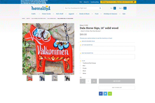
Instead, their attention is drawn to the product image gallery, and any necessary attribute fields. All descriptive text, reviews, and recommended products are available, but remain clear from view until the shopper requires them.
TIP: Keeping the product page clear of unnecessary text and images allows the shopper to focus on the product. There’s less of a chance of distracting them before they have a chance to click that “Add to cart” button.
Is It Time For You To Update?
There are plenty of reasons for you to update your eCommerce site: to advance with technology, re-brand, to grow. One of the most important indicators to look at though, is whether you’re able to provide the best possible service to your customer. Your unresponsive theme, lackluster design, and messy setup are getting in the way of customer satisfaction and conversions. It’s time to consider an upgrade.
The changes described above were responsible for taking the old Hemslojd site into the 21st century, and the new era of eCommerce design. The Glendale Designs team was thrilled to be able to provide a finished product that garnered the title of Miva’s 2020 Blades Award Most Improved Website of the Year. We strive to build every project – large and small – with the same level of dedication and ingenuity. [click here for even more details on how we built the new Hemslojd.com]
Do you encounter any of the issues that the old Hemslojd Inc. site used to have? Reach out to us and we can work on solutions with you.